Anopa Filter Clear
Wraps a designed button and clears active filters when clicked. Can clear all filters at once or target a specific dimension, and can optionally hide when there is nothing to clear.
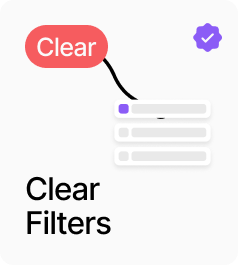
AnopaFilterClear wraps a designed button and clears active filters when clicked. By default it clears all filter dimensions at once, but it can also target a specific dimension — categories, tags, collections, colors, vendors, a named variant option, or the price filter — by setting the Clears control. When Hide When Empty is on, the component renders nothing if there are no active selections to clear, keeping the interface clean. At 35% opacity it signals a disabled state when empty but Hide When Empty is off.
Property Controls
Button UI
—
Connect any Framer component to act as the clear button visual.
Clears
all
Which filter dimension to clear on click. All Filters clears everything. Specific dimensions (Categories, Tags, Collections, Colors, Vendors, Option, Price) clear only that dimension.
Option Name
Size
The option name to clear when Clears is set to Option. e.g. Size, Material, Fit. Only shown in Option mode.
Hide When Empty
true
When on, the component renders nothing when there are no active filters to clear for the targeted dimension.