Anopa Filter
Renders a single filterable dimension — categories, tags, collections, colors, vendors, a named variant option, or price. Multiple instances build a complete filter sidebar. All share state through the Anopa filter store.
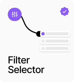
AP_AnopaFilter renders a single filterable dimension and writes selections into the shared filter store so AnopaCatalog updates automatically. Seven variants are available: Categories, Tags, Collections, Colors, Vendors, Option (any named variant option such as Size or Material), and Price. Each variant has a sensible default display — checkboxes for categories and collections, buttons for tags and options, swatches for colors — but you can override the display mode for any variant. Multiple instances of this component build a complete filter sidebar. The accent color drives the active state across checkboxes, buttons, and swatches unless individually overridden. An optional inline search field appears for lists longer than five items. The Price variant renders a single button that toggles a price filter with configurable range, under, or over modes, using the active market’s currency symbol automatically.
Property Controls
Variant
categories
Which filter dimension to render. Options: Categories, Tags, Collections, Colors, Vendors, Option, Price.
Option Name
Size
The exact Shopify option name to filter by when Variant is set to Option. Case-insensitive. Only shown in Option mode.
Price Config
—
Price filter settings: Mode (Range / Under / Over), Min Value, Max Value, and Display Text override. Only shown in Price mode.
Display As
auto
How the filter options are rendered. Auto = default per variant. Options: Auto, Checkboxes, Buttons, Dropdown, Swatch. Hidden in Price mode.
Layout
vertical
Direction of the filter options list. Vertical or Horizontal. Hidden in Price mode.
Accent Color
#007bff
The primary interactive highlight color. Used as the default for checkbox checked state, button active background, and swatch selection ring unless individually overridden.
Show Title
true
Show or hide the filter group title above the options.
Title
—
Title label styling: font, color, and padding. Hidden when Show Title is off.
Show Count
true
Show the number of active selections next to the title.
Counter
—
Counter badge styling: font, color (defaults to Accent Color), background, padding, and border radius. Hidden when Show Count is off.
Enable Search
false
Show an inline search field for filtering the option list. Only appears when the list has more than 5 items.
Checkbox Style
—
Checkbox appearance: font, label color, size, radius, border width, unchecked/checked background and border, check mark color, gap, and item spacing.
Button Style
—
Button pill appearance: font, padding, border, radius, inactive and active background and text colors, and gap between buttons.
Swatch Style
—
Colour swatch appearance: size, radius, gap, border, selection ring, and optional label font, color, and gap.
Dropdown Style
—
Multi-select dropdown appearance: font, padding, border, radius, and background. Only shown in Dropdown mode.