Variant Selector
Renders product option selectors (size, colour, material) and writes the chosen variant to the shared store. Supports Buttons, Swatches, and All modes.
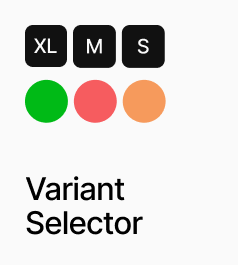
AP_VariantSelector renders the option selectors for a product — size, colour, material, or any other Shopify variant option — and writes the chosen combination to the shared variant store so AP_AddToCartButton and AP_VariantPrice always reflect the current selection. It supports three display modes: Buttons renders text buttons for non-colour options, Swatches renders colour circles for colour options, and All renders both in a single instance. Swatch colours are sourced automatically from Shopify’s native swatch data, with a JSON colour map available as a fallback. Unavailable option combinations are shown as disabled with an optional strikethrough line. Button and swatch styling — size, radius, colours, ring, gap, and out-of-stock appearance — are all configurable from the panel. Multiple instances of this component on the same PDP share selection state automatically, so a Buttons instance and a Swatches instance for the same product always stay in sync.
Property Controls
Show
buttons
Buttons = renders non-colour options as text buttons only. Swatches = renders colour options as colour circles only. All = renders both in one instance.
Product ID
—
The Shopify product ID. Used to fetch live variant data and swatch colours.
Variant Field
—
The variant string passed from the CMS, encoding all option names, values, and variant IDs. This field is generated by Anopa’s CMS setup.
Auto-select First
true
When on, automatically selects the first available option value for each option group on load.
Color Map
—
JSON fallback colour map used when Shopify swatch colours are not configured. Format: {"Black": "#000000", "Beige": "#e8d5b7"}. Only shown in Swatches or All mode.
Button Styles
—
Styling for text-based option buttons. Includes font, gap, padding, radius, border, default and selected colours, selection ring, group label settings, and out-of-stock appearance.
Swatch Styles
—
Styling for colour swatch circles. Includes size, radius, gap, border, selection ring, optional label display, and out-of-stock appearance. Hidden in Buttons mode.