Cart Items Display
Renders the full list of cart line items with configurable layout, pricing, and interactions.
What it does
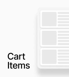
AP_CartItemsDisplay renders the full list of cart line items. Each item includes a product image, title, variant options, price (including compare-at pricing), a quantity selector, and a remove button. Every element's position is configurable, and prices automatically re-fetch in the correct currency when the active market changes.
How to set it up
Place this component inside your cart drawer or cart page. It does not require any slot connections — all rendering is handled internally, with full styling exposed through property controls. On the canvas it shows two dummy items so you can design around realistic content, while at runtime it connects to the actual cart.
Key behaviours
- Three price position options: Top Right, Below Title, or Inline with Title
- Three quantity position options: Below Variant, Bottom Row, or Top Right
- Three remove button positions: Bottom Right, Top Right, or Inline with Quantity
- Market-aware: re-fetches variant prices when activeMarket changes and fades to 65% opacity during the re-fetch
- Optional navigation: clicking a cart item can navigate to its product page
- On canvas: always shows two dummy items for layout and styling
- At runtime: renders nothing when the cart is empty
- Free plan users see an Upgrade Anopa banner below the item list
AP_CartItemsDisplay
AP_CartItemsDisplay renders the full list of line items currently in the cart and gives you full visual control from the panel.
What it does
- Renders all cart line items: Each cart item is displayed with its product image, title, selected variant options, price, quantity selector, and a remove button.
- Configurable layout (no code): You control where each element appears (e.g. price above or below title, quantity selector left or right, remove button inline or separate) using position controls instead of editing code.
Property Controls
Navigation — Enable Click
false
When on, clicking a cart item navigates to its product page.
Navigation — URL Base
/products/
URL prefix prepended to the product handle when navigating. e.g. /products/
Navigation — Close Drawer
true
When on, closes the cart drawer before navigating to the product page.
Positions — Price
top-right
Where the price block appears within each item row. Options: Top Right, Below Title, Inline with Title.
Positions — Quantity
below-variant
Where the quantity selector appears. Options: Below Variant, Bottom Row, Top Right.
Positions — Remove
bottom-right
Where the remove button appears. Options: Bottom Right, Top Right, Inline with Qty.
Image — Width
88px
Width of the product image. Height is derived from the chosen aspect ratio. Range: 40–240.
Image — Aspect
3:4
Aspect ratio of the product image. Options: 1:1, 3:4, 4:5, 2:3, 16:9.
Image — Radius
8px
Corner radius on the product image. Range: 0–48.
Item — Padding
16px 0px
Padding around each cart line item row.
Item — Gap (Image↔Content)
16px
Horizontal gap between the product image and the content/description column.
Layout — List Gap
0px
Vertical gap between individual cart item rows.
Title — Font
14px / 1.4em
Typography for the product title in each cart item.
Title — Color
#111111
Text color for the product title.
Price — Font
14px
Typography for the price text.
Price — Color
#111111
Text color for the current price.
Price — Decimals
2
Number of decimal places shown for prices. Range: 0–6.
Compare At — Show
true
When on, displays the compare-at price alongside the current price.
Compare At — Strikethrough
true
When on, applies a strikethrough style to the compare-at price.
Qty Container — Background
#f2f2f2
Background color of the quantity selector pill/container.
Qty Buttons — Size
24px
Size of the + and − increment/decrement buttons. Range: 16–48.
Qty Buttons — Icon Color
#111111
Color of the + and − button icons.
Remove — Size
24px
Size of the remove button. Range: 16–48.
Remove — Opacity
0.4
Opacity of the remove button icon. Range: 0–1.