Add To Cart Button
Primary add-to-cart action for a product detail page, handling variant selection, availability, and cart updates with multiple visual states.
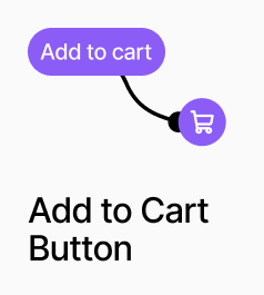
Add To Cart Button is the primary add-to-cart action component for a product detail page (PDP). It reads the currently selected variant from the shared variant store, checks availability, and adds the product to the cart on click. The button automatically renders different design slots depending on the current state: Available, Loading, Out of Stock, or Select Variant.
AP_AddToCartButton
What it does
AP_AddToCartButton is the primary add‑to‑cart action for a product detail page. It:
- Reads the currently selected variant and quantity.
- Adds that variant and quantity to the cart when clicked.
- Can optionally open a cart drawer immediately after a successful add, keeping the cart visible without a page reload.
The button exposes four distinct visual states, each mapped to its own component slot so you can design them independently in Framer:
- Available – The default, clickable add‑to‑cart state when the selected variant is in stock.
- Loading – Shown while the add‑to‑cart request is in progress.
- Out of Stock – Shown when the selected variant is unavailable or has no remaining stock.
- Select Variant – Shown when no valid variant has been selected yet (e.g. required options not chosen).
By default, the active state is determined automatically from the selected variant’s availability and stock level, but you can also force the button into a specific state for design and testing.
How to set it up
- Place the component on your product detail page
- Add
AP_AddToCartButtonto the layout where you want the primary purchase action.
- Connect it to product and variant data
- Bind the component to your product data source.
- Ensure it can read the currently selected variant (e.g. from variant pickers) and quantity (e.g. from a quantity selector).
- Design each visual state via slots
- Open the component’s slots in Framer and design each state separately:
- Available slot: Primary button styling, e.g. “Add to cart”.
- Loading slot: Show a spinner, progress indicator, or “Adding…” label.
- Out of Stock slot: Disabled style, e.g. “Out of stock”.
- Select Variant slot: Prompt style, e.g. “Select size” or “Choose options”.
- Configure state behaviour
- Leave state on Automatic to let the component choose the correct state based on:
- Whether a variant is selected.
- Whether that variant is in stock.
- Optionally, override/force a specific state in the component props for:
- Visual QA and design reviews.
- Prototyping flows without live data.
Property Controls
Product ID
—
The Shopify product ID for this product. Required for the button to add the correct item to the cart.
Force State
auto
Overrides the automatic state logic. Options: Auto, Available, Loading, Out of Stock, Select Variant. Leave on Auto when publishing live.
Open Drawer on Add
true
When on, the cart drawer opens immediately after a successful add. When off, the item is added silently.
Available
—
The component slot rendered when the variant is in stock and ready to add. Typically your primary button design.
Loading
—
The component slot rendered while the add-to-cart action is in progress. Use a spinner or a disabled button state.
Out of Stock
—
The component slot rendered when the selected variant has no available stock.
Select Variant
—
The component slot rendered when no valid variant has been selected yet. Use a prompt like "Select size" or "Choose options".