Close Popup
Closes the MarketingPopup when clicked. Place inside your popup design slot and wrap a custom icon or button.
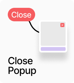
AP_ClosePopup closes the active MarketingPopup when clicked. Place it inside your popup design — typically as a close or dismiss button — and connect your icon or label component to the Button slot. Clicking dispatches a close event that any active MarketingPopup on the page will respond to, with no prop drilling required. A configurable hit area expands the clickable region beyond the visible icon for better touch targets.
Property Controls
Button
—
The visual close button. Connect any Framer component — an X icon, a text link, or a styled button.
Hit Area
8px
Invisible padding that expands the clickable area beyond the visible button. Range: 0–40.
Cursor
pointer
CSS cursor style when hovering the close button. Options: pointer, default, crosshair.