Anopa Filter Sort
Renders a product sort control connected to the Anopa filter store with configurable options and display modes.
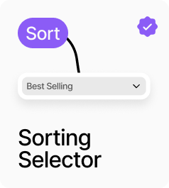
AnopaFilterSort renders a product sort control connected to the filter store, so AnopaCatalog updates immediately when the selection changes. It supports two display modes: Dropdown renders a styled native select element, and Buttons renders a row of toggle buttons. The available sort options are configurable — choose from Featured, Price Low–High, Price High–Low, Name A–Z, Name Z–A, Newest First, and Best Selling. All styling — title, dropdown appearance, button appearance, and active button appearance — is configurable from the panel.
Property Controls
Title
Sort By
Label shown above the sort control when Show Title is on.
Show Title
true
When on, displays the title label above the sort control.
Display
dropdown
Dropdown = native select element. Buttons = a row of toggle buttons, one per sort option.
Sort Options
featured, price-asc, price-desc, name-asc, name-desc
Which sort options to include. Choose from: Featured, Price Low–High, Price High–Low, Name A–Z, Name Z–A, Newest First, Best Selling.
Container
—
Wrapper container styling: background color, padding, and border radius.
Title Style
—
Font and color for the title label. Hidden when Show Title is off.
Dropdown Style
—
Background, text color, border color/width, border radius, font, and padding for the dropdown. Hidden in Buttons mode.
Button Group
—
Gap between buttons in the button group. Hidden in Dropdown mode.
Button Style
—
Background, text color, border color/width, border radius, font, and padding for inactive buttons. Hidden in Dropdown mode.
Active Button
—
Background, text color, and border color for the active/selected button. Hidden in Dropdown mode.
Show Dropdown Icon
true
When on, shows a chevron icon inside the dropdown to indicate it is interactive.