Stock Remaining
Shows availability messaging for the selected variant. Two modes: Text (styled messages per state) and Slots (connect your own component instances). Four states: Select Options, Sold Out, Low Stock, and Available.
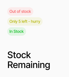
AP_StockRemaining shows availability messaging for the selected variant, cycling through four states: Select Options (no variant chosen), Sold Out (unavailable or zero stock), Low Stock (at or below the threshold), and Available. It has two modes. In Text mode, each state renders a styled line of text that you configure with a message, colour, font, and optional background box — no slot connections required. In Slots mode, you connect your own component instances to each state slot, which lets you use any design including icons, animated indicators, or AP_StockCount to display the live quantity number inside the slot. The Low Stock threshold is configurable. On canvas, a Preview State control lets you see any state while designing.
Property Controls
Product ID
—
The Shopify product ID for this component. Used to match the selected variant to the correct product.
Mode
text
Text = renders a styled message per state. Slots = renders connected component instances per state.
Preview State
available
Canvas only — preview a specific state while designing. Options: Select Options, Sold Out, Low Stock, Available.
Low Stock At
5
Quantity threshold at or below which the Low Stock state is shown instead of Available. Range: 1–99.
Available
—
Slot shown when the variant is in stock and above the low stock threshold. Slots mode only.
Low Stock
—
Slot shown when stock is at or below the Low Stock At threshold. Slots mode only.
Sold Out
—
Slot shown when the variant is unavailable or has zero stock. Slots mode only.
Select Options
—
Slot shown when no valid variant has been selected yet. Slots mode only.
Base Box
—
Shared container styles applied to all Text mode states. Includes text color, background, padding, border, and radius. Text mode only.
Available
—
Text, color, font, background, and optional box override for the Available state. Text mode only.
Low Stock
—
Text (supports {{count}} placeholder), color, font, and optional box override for the Low Stock state. Text mode only.
Sold Out
—
Text, color, font, and optional box override for the Sold Out state. Text mode only.
Select Options
—
Text, color, font, and optional box override for the Select Options state. Text mode only.